
Understand dashboard UI
Learn how FastPix Dashboard UI provides insights into video startup, playback, stability, and render quality metrics.
You can access Video Data dashboard here.
Getting started for first time user
Upon Clicking on Video Data for the first time after Signup, it will redirect to the page as shown below per workspace of an organization.
PLEASE NOTE
While signing up for the first time, you will be prompted to create an organization. Otherwise, you can always create a new organization in your Account Settings dashboard.
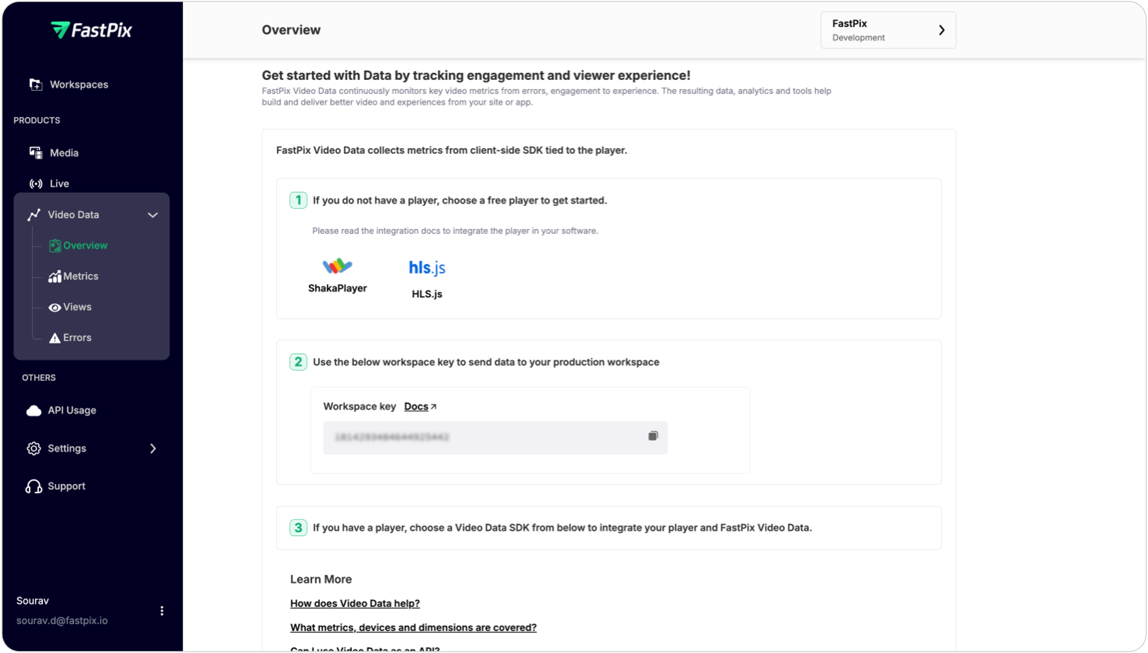
After choosing the player of your choice you can proceed with the SDK integration of respective player.
PLEASE NOTE
This is a one-time activity, and you will not see this page after integrating the SDK with the player.
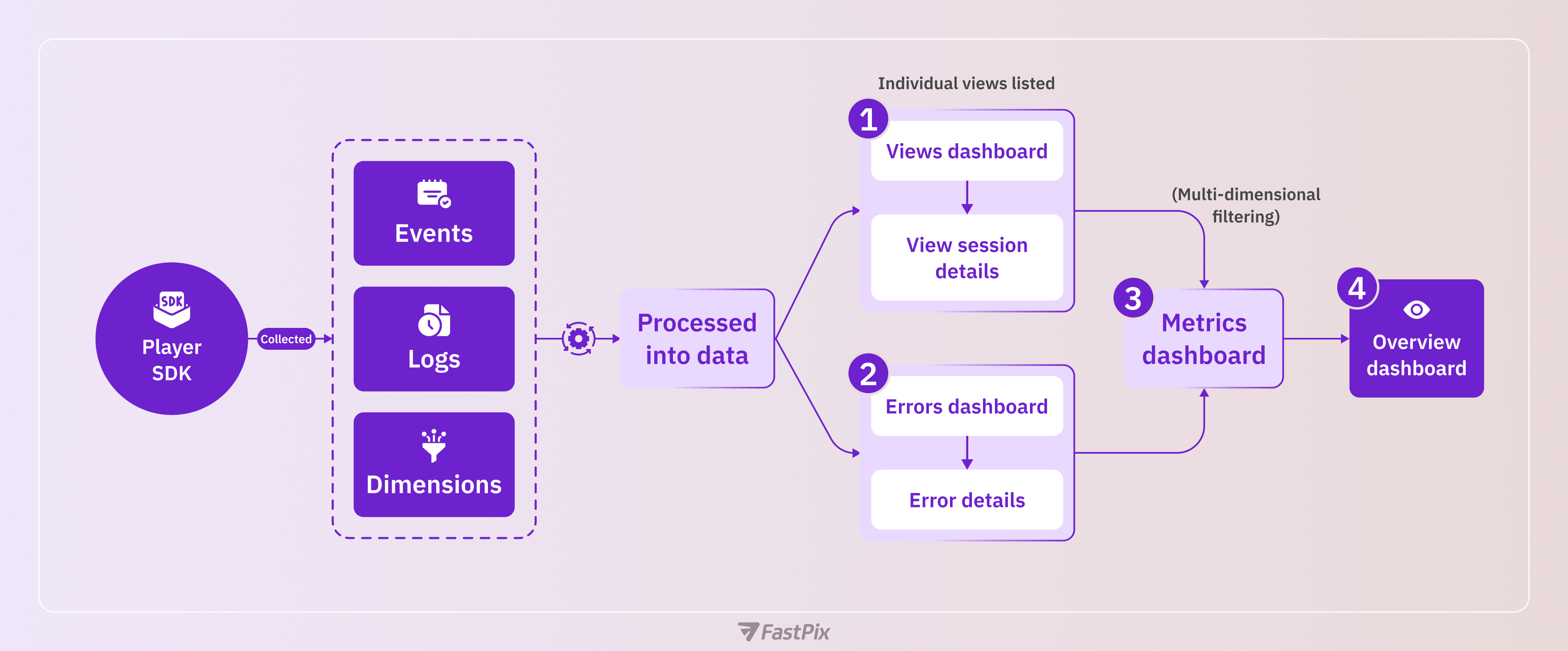
Once playback events and metrics are collected and processed into data, video performance can be visualized across our four major dashboard screens. When using the bottom-up approach, data can be consumed from these dashboards in sequence.
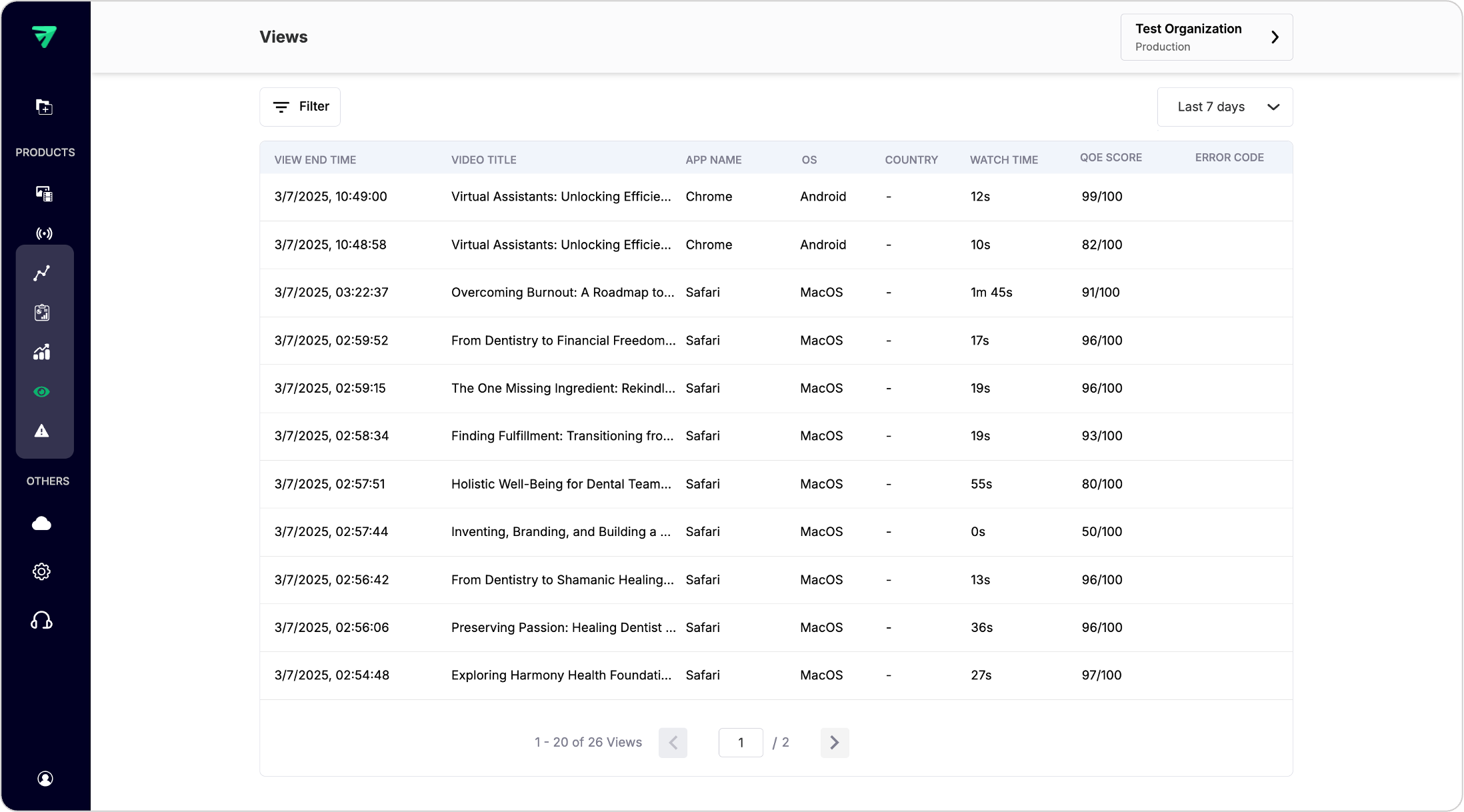
1. Views dashboard
Displays a list of individual views tracked within the specified timeframe across different filters.
Features:
- View list: A comprehensive table showing all tracked views with relevant details such as viewer ID, timestamp, and duration.
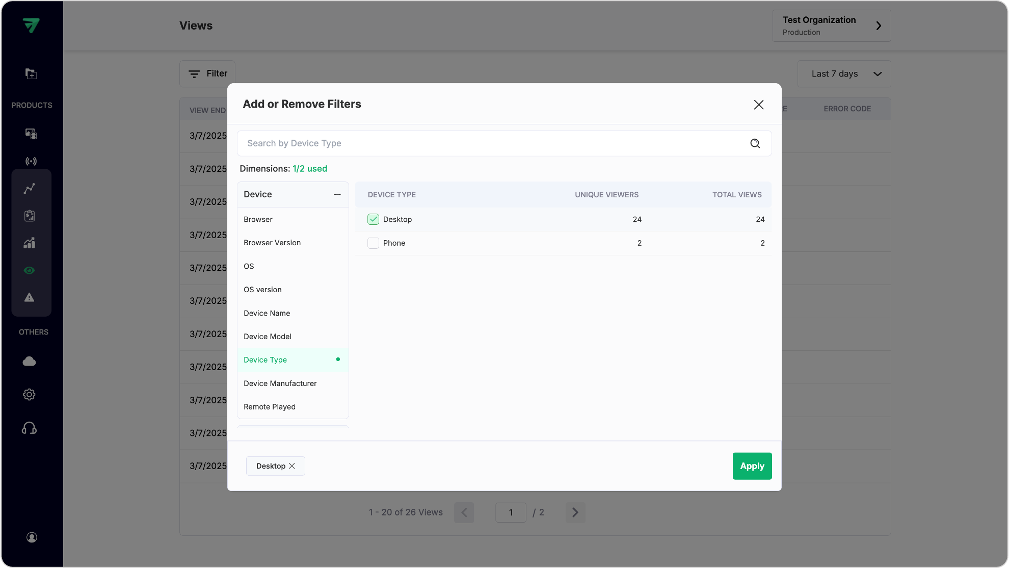
Filter view sessions
You can filter views based on parameters like date range, video title, or viewer demographics. Below is a reference image showing views filter selected as “Desktop” for “Device Type”.
Once filter is applied, you get the view results listed out. Now you can also filter out these views by selecting different timeframes. Clicking on one of the views will open up the view details page, explained in the next section.

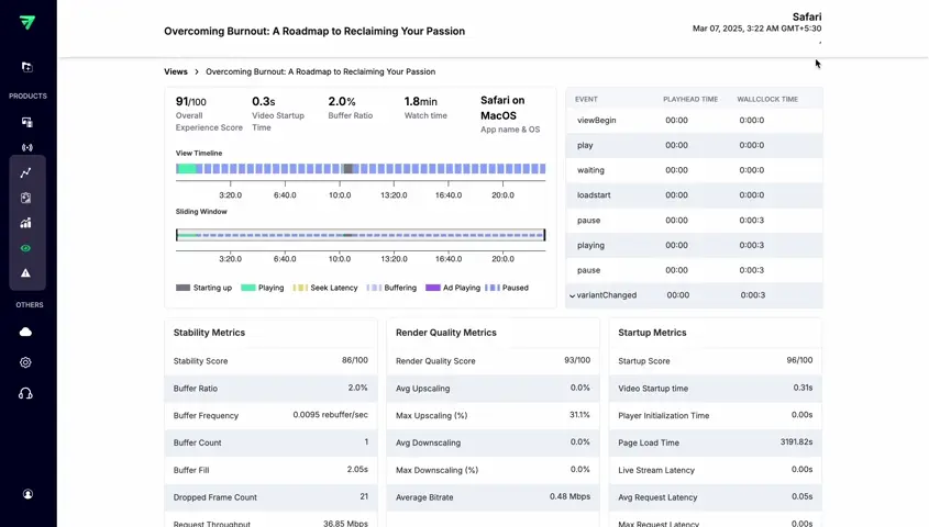
View session details
Clicking on any view opens a detailed page containing all data related to that particular view, including metrics like watch time, engagement rate, and viewer interactions as listed below:
- Watch time: The total duration a user spends watching content.
- View timeline: A chronological breakdown of the user's actions during the session.
- Geography details: Information about the user's location, which can impact network conditions and video quality.
- Network details: Data on the user's internet connection, including speed and stability.
- Video details: Specifications about the video itself, such as resolution and format.
- Device details: Information about the device used to view the content, including type and specifications.
- Custom details: Additional data specific to the user or session, such as custom dimensions.
PLEASE NOTE
Most of the metadata shown is automatically detected by us but some of them have to be passed by the developer at the time of integrations. More details can be found here .
Events in the view session
To understand the Quality of experience (QoE) for a single view, you need to look into the users journey within the video watch. This can be achieved by leaving markers at each step that happens in the player during the video playback.
Our Video Data solution listens to these markers or events that are generated by the player and collect them and enrich them with relevant information by integrating our SDKs. These events hold relevant information related to the viewer journey, his network conditions, rebuffering details, player details, streaming details, video details the time it took to start his video etc. This information helps us to calculate the total viewer satisfaction with the viewing session.
Key events for tracking user journey
The following events are crucial for monitoring the user's journey during video playback:
playerReady: Indicates that the player is ready to start playing the video.viewBegin: Marks the beginning of the video view.variantChanged: Occurs when the video quality or format changes during playback.requestCompleted: Signals the completion of a request for video content.play: Triggers when the video starts playing.playing: Continuously monitors the video playback status.waiting: Indicates that the player is waiting for more data to continue playback.buffering: Occurs when the video is buffering due to insufficient data.buffered: Signals that buffering has completed, and playback can resume.seeking: Triggers when the user seeks to a different part of the video.seeked: Indicates that seeking has completed.pulse: Periodic checks to ensure continuous playback.requestCanceled: Signals that a request for video content has been canceled.error: Triggers when an error occurs during playback.pause: Indicates that the video playback has been paused.requestFailed: Signals that a request for video content has failed.loadstart: Marks the beginning of video loading.viewCompleted: Indicates that the video view has completed.
How these events enhance QoE
These events provide valuable insights into the viewer's journey, including:
- Network conditions: Events like buffering and waiting help assess network performance.
- Rebuffering details: Buffering and buffered events provide insights into rebuffering frequency and duration.
- Player details: Events like
playerReadyandloadstartoffer information about player performance. - Streaming details: Events such as play and playing monitor the streaming experience.
- Video details:
variantChangedandrequestCompletedprovide insights into video quality changes and content delivery. - Startup time: The time from
loadstartto play indicates how quickly the video starts.
How we calculate user experience
By analyzing these events, we calculate user satisfaction based on factors such as:
- Buffering rates: Frequent buffering negatively impacts QoE.
- Startup times: Faster startup times enhance user experience.
- Video quality: Consistent high-quality video improves engagement.
- Playback stability: Smooth playback without interruptions is crucial for a positive QoE.
2. Errors dashboard
Purpose: Provides insights into errors encountered during video playback across different platforms.
Structure:
- Error metrics: Similar layout as the Metrics section but focused on error data:
- Shows percentage of errors by platform (Web, iOS, Android)
- Shows total number of errors recorded
- Top errors list: Display the most common errors encountered by users with descriptions.
- Errors list:
- Detailed view of error types and their frequencies.
- Options to filter errors by timeframe and platform.
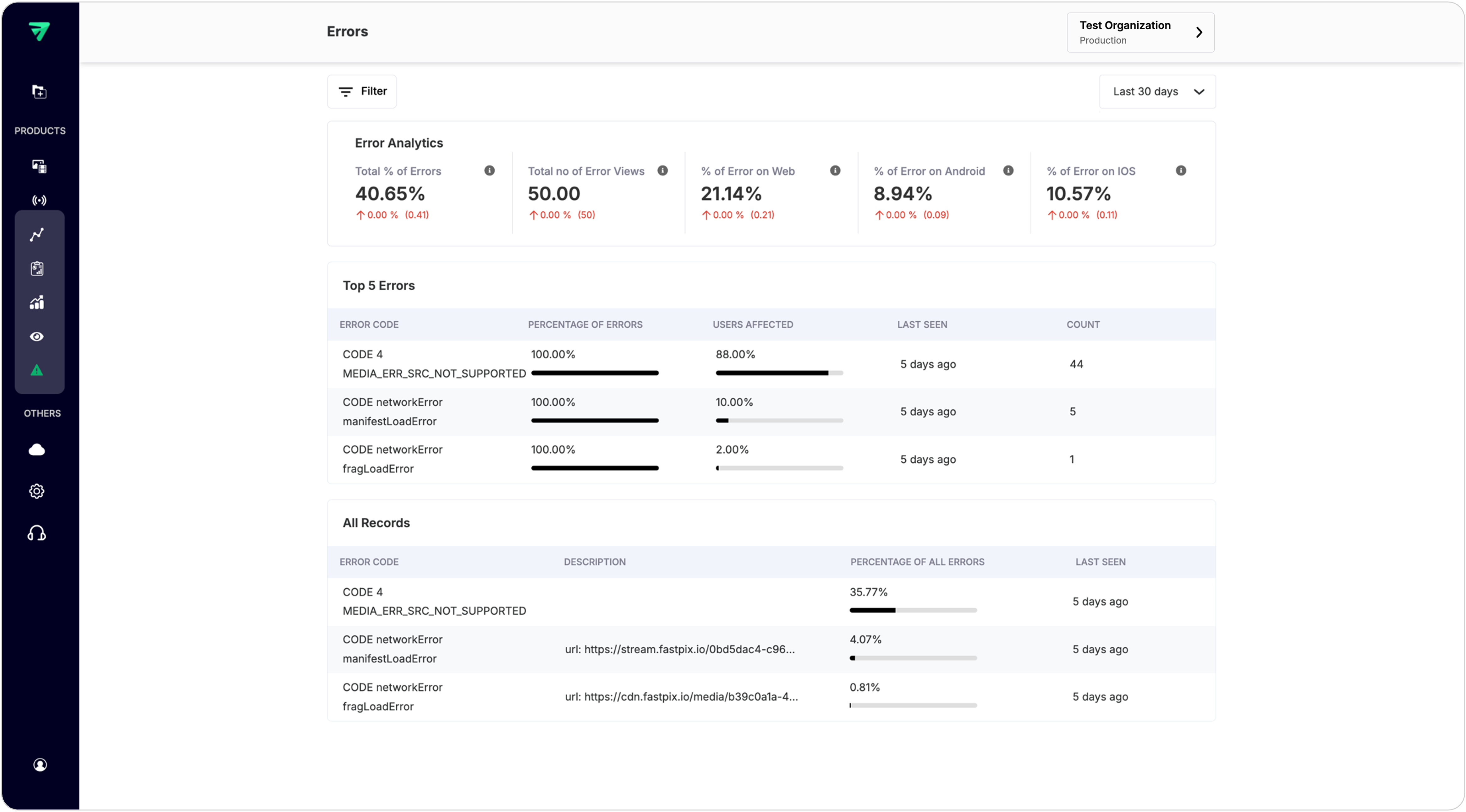
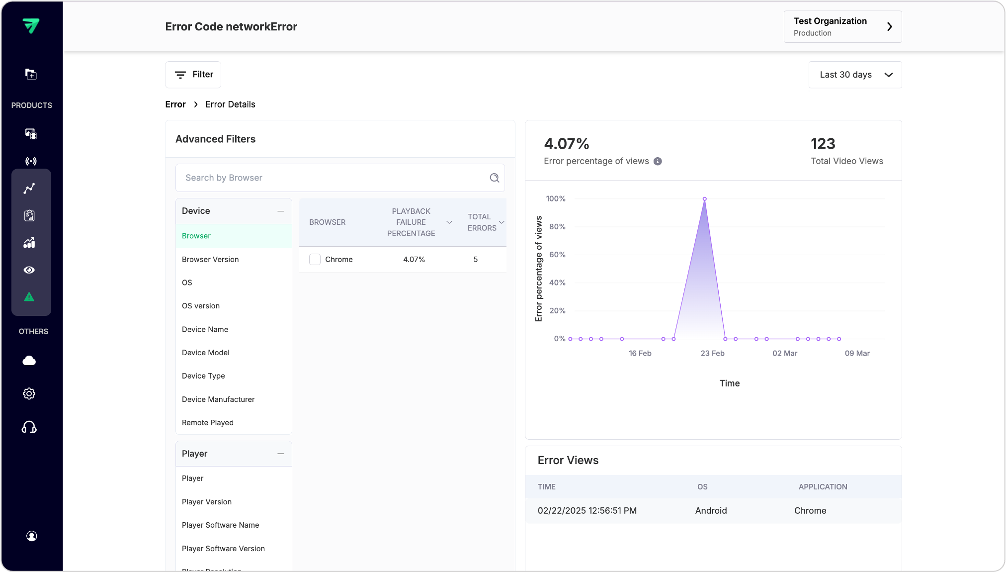
View error details
You can navigate to error details by clicking on error record from All Records section. The navigation of this page is similar to the Metrics Page.
For instance, in the reference below a network error happened specific to a Chrome browser running on an Android OS with a 4.07% of total viewers who got affected with the error.
3. Metrics dashboard
Purpose: Detailed breakdown of all metric scores for a given workspace.
Structure: Displays metric scores such as
- Total Views (includes Unique Viewers, Playing time)
- Quality of Experience (QoE) Score
- Stability Score (includes buffering metrics)
- Startup Score (includes video startup time, player startup time, exit before video start)
- Render Quality Score (includes avg downscaling, upscaling, average bitrate)
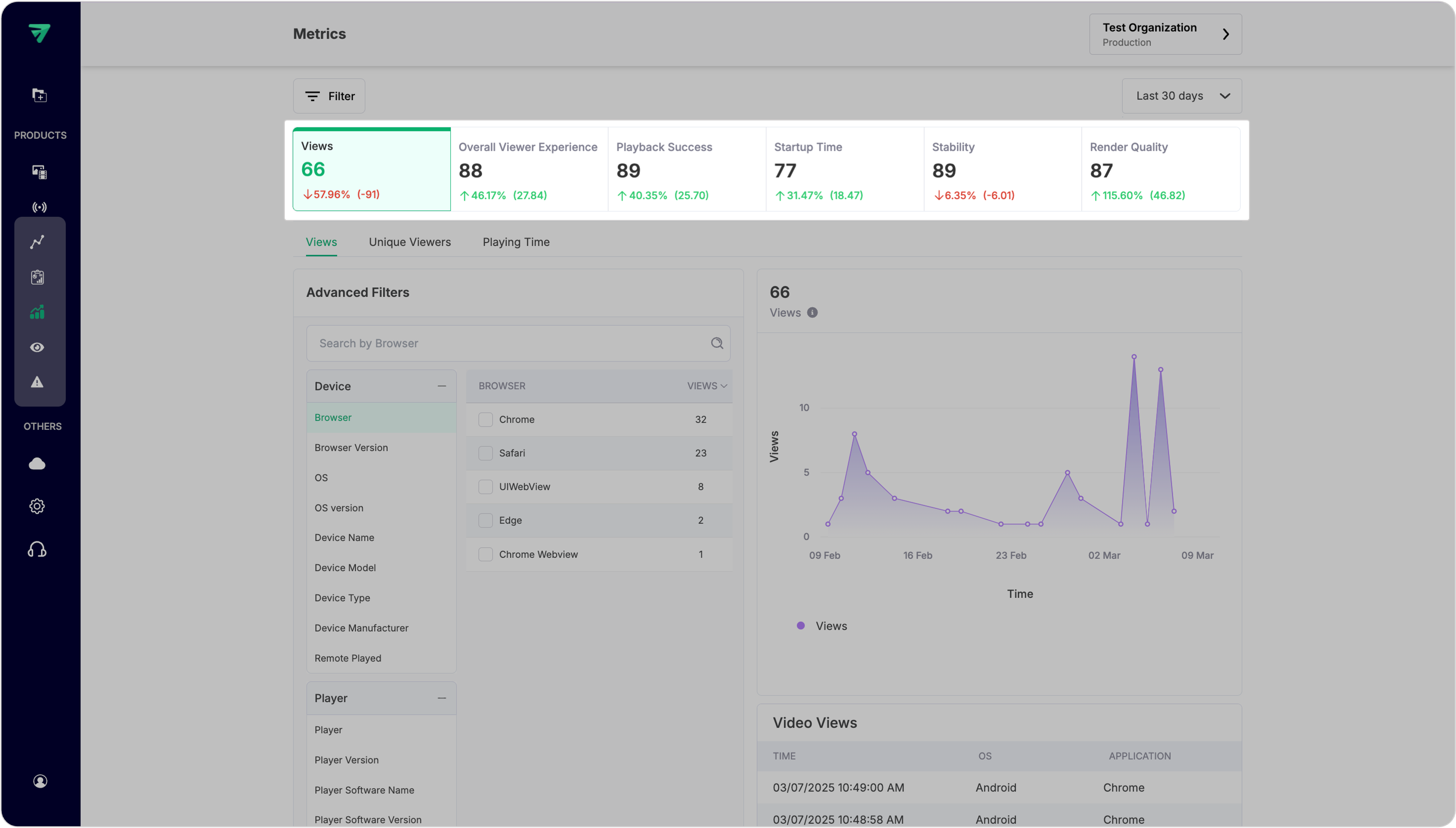
Each metric in the structure directs users to a sub-section below containing detailed metrics related to that category.
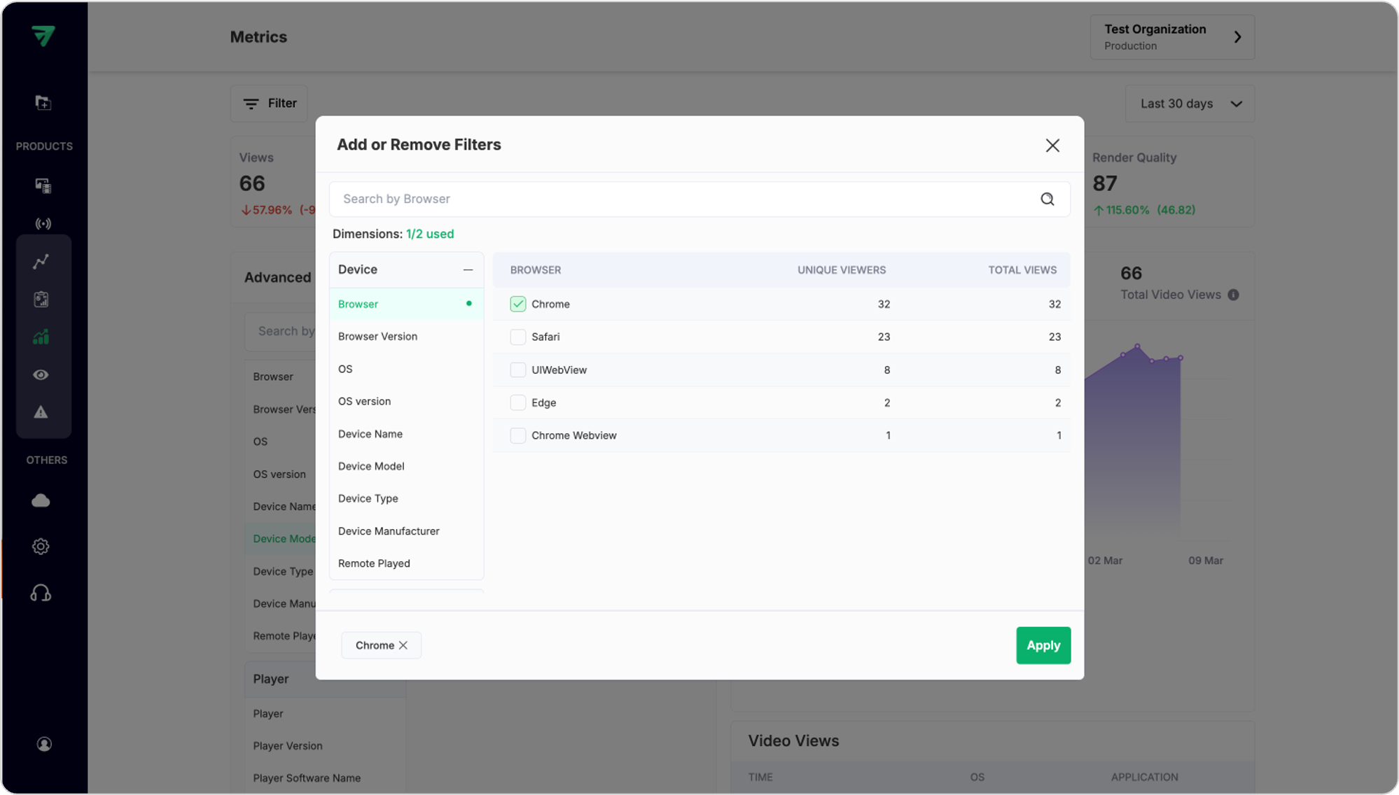
Advanced filters for metric breakdown
Each metric showcases its value and can be broken down across different dimensions (e.g., device used, geographic location, etc.).
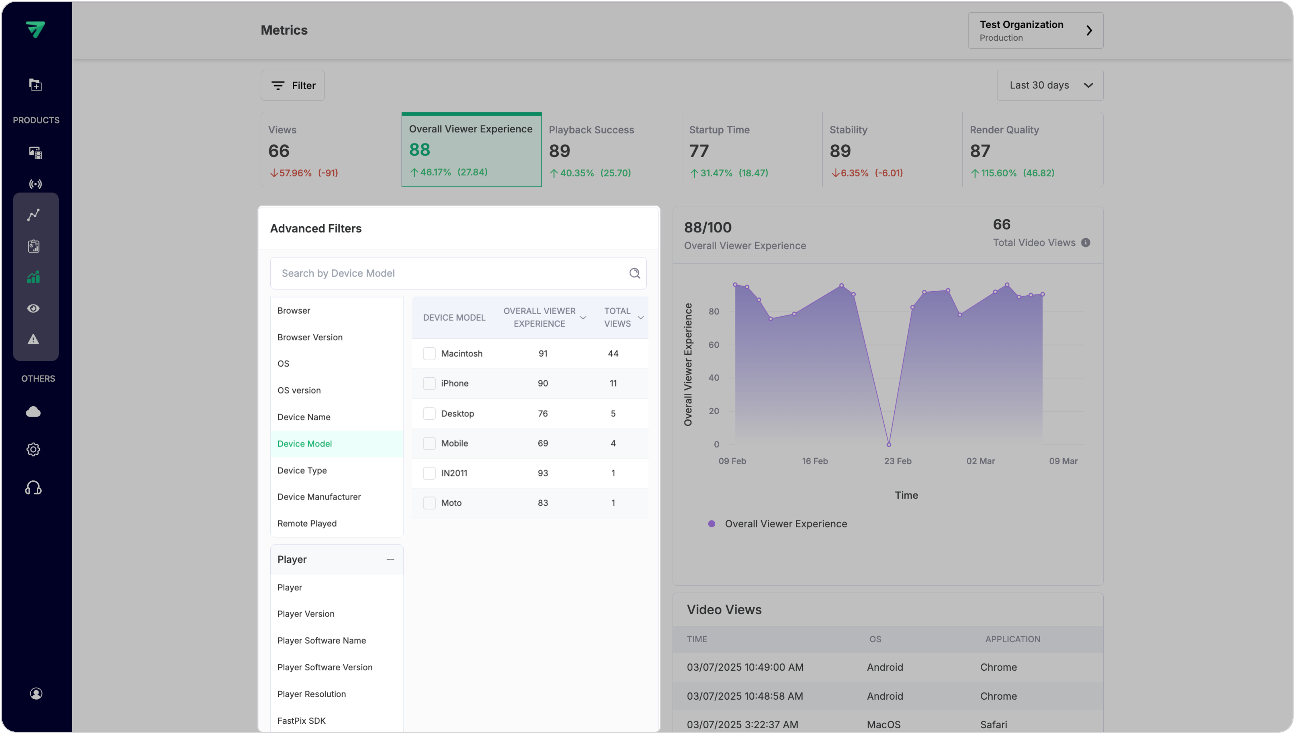
Filters and timeframes
In the top-left of your dashboard you get a filter button which gives you options to select filters (e.g., device type, CDN,). You can select filters from upto 2 dimensions at a time if you’re in the starter plan. But there is no limit on selecting multiple filters under any dimension.
PLEASE NOTE
Starter plan comes with restrictions (100k views, 2 filter limits, and 2 custom field limits). You can upgrade to growth plan and remove these restrictions. See pricing.
Once the filters are applied, the dashboard will show the filter-specific data. To further segment your data across timeframes, use the dropdown on the top-right to select from 60 minutes to upto 30 days. This will generate time series graphs to visualize changes over selected periods, filters and advanced filter values as below.
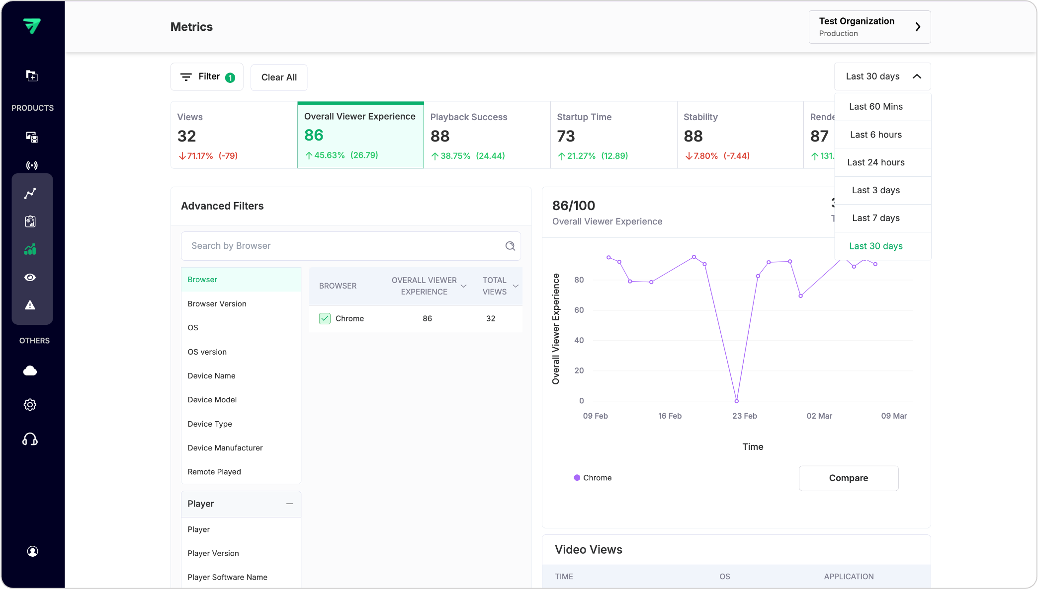
PLEASE NOTE
Dashboard only shows data for the last 30 days. If you are using our Video Data APIs to pull data for larger context and building observability platforms for your application, you can get data for the last 90 days.
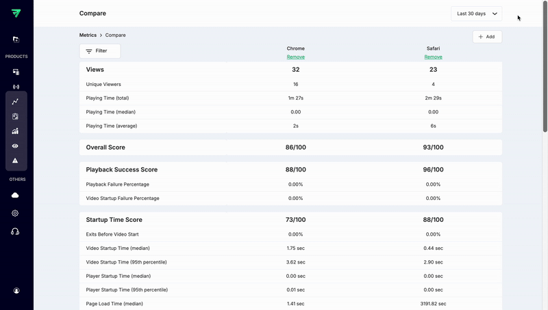
Compare metrics
After selecting at least one value in any of the advanced filters (eg., Browser) it will enable “Compare” button below the Graph.
Once you click compare, this page will give you a comparison of all metrics for a given filter/breakdown. It gives you an option to add as many values of a selected filter that are available and get comparison metrics across different timeframes as well.
List of dimensions to filter data
When using APIs, Video Data gives you a set of 56 dimensions that serve as filters for slicing and dicing your data. These dimensions allow you to customize your analysis, enabling you to gain deeper insights into your metrics. By applying these filters, you can segment your data based on various criteria, such as user behavior, geographic location, time periods, and more. This lets you to explore trends, identify patterns, and make informed decisions based on your specific analytical needs.
| Dimension | Parameter | Definition |
|---|---|---|
| Browser | browser_name | The web browser used by the viewer to access the video content (e.g., Chrome, Firefox). |
| Browser Version | browser_version | The specific version of the web browser being used. |
| OS | os_name | The operating system of the device used to access the content (e.g., Windows, iOS). |
| OS Version | os_version | The version of the operating system running on the device. |
| Device Name | device_name | The name of the device used to access the video (e.g., MacBook Pro). |
| Device Model | device_model | The specific model of the device (e.g., iPhone 12, Galaxy S21). |
| Device Type | device_type | The category of device (e.g., desktop, mobile, tablet). |
| Device Manufacturer | device_manufacturer | The manufacturer of the device (e.g., Apple, Samsung). |
| Remote Played | player_remote_played | Indicates whether the video was played remotely (true/false). |
| Player | player_name | The name of the video player used for playback. |
| Player Version | player_version | The version of the video player software. |
| Player Software Name | player_software_name | The name of the software framework used by the player (e.g., Shaka Player). |
| Player Software Version | player_software_version | The version of the player software framework. |
| Player Resolution | player_resolution | The resolution at which the player is configured to display content. |
| FastPix FP SDK | fp_sdk | The FastPix SDK used for playback, if applicable. |
| FastPix FP Version | fp_sdk_version | The version of the FastPix SDK being used. |
| Player Autoplay | player_autoplay_on | Indicates whether autoplay is enabled for the video (true/false). |
| Player Preload | player_preload_on | Indicates whether preloading of video content is enabled (true/false). |
| Video Title | video_title | The title of the video content being viewed. |
| Video ID | video_id | Unique identifier for this specific video content. |
| Video Series | video_series | Series name associated with the video, if applicable; otherwise may be blank or null. |
| FastPix Playback ID | fp_playback_id | Unique identifier for playback sessions using FastPix technology. |
| Media ID | media_id | Unique identifier for media content, if applicable. |
| FastPix Live Stream ID | fp_live_stream_id | Unique identifier for live streaming sessions using FastPix technology. |
| Video Content Type | video_content_type | Type of content being viewed (e.g., movie, series, documentary). |
| Video Source Stream Type | video_source_stream_type | Type of stream from which the video is sourced (e.g., live, on-demand). |
| Video Source Type | video_source_type | Source type from which the video is delivered (e.g., application/dash+xml). |
| Video Encoding Variant | video_encoding_variant | Specific encoding variant used for delivering the video stream. |
| Experiment Name | experiment_name | Name of any experiment associated with this video view, if applicable. |
| Sub Property ID | sub_property_id | Identifier for any sub-properties associated with this view, if applicable. |
| DRM Type | drm_type | Type of Digital Rights Management applied to the video content. |
| ASN | asn_name | Autonomous System Number associated with the viewer's IP address. |
| CDN | cdn | Content Delivery Network used to deliver the video stream. |
| Source Hostname | video_source_hostname | Hostname from which the video content is served (e.g., acdn.ibee.ai). |
| Connection Type | connection_type | Type of network connection used by the viewer (e.g., Wi-Fi, cellular). |
| View Session ID | view_session_id | A unique identifier assigned to each viewing session, allowing for correlation with upstream services such as CDN or origin logs. |
| Continent | continent | Geographic continent from which the viewer accessed the content. |
| Country | country | Country associated with the metrics in this view; typically represented by a two-letter ISO code (e.g., US). |
| Region / State | region | Specific region or state within a country associated with this view metrics. |
| Viewer ID | viewer_id | Unique identifier for the viewer accessing this content. |
| Error Code | error_code | Code indicating any errors encountered during playback, if applicable. |
| Exit Before Video Start | exit_before_video_start | Indicates whether the viewer exited before playback began (true/false). |
| Video Has Ad | video_has_ad | Indicates whether ads were shown during playback (true/false). |
| Video Startup Failure | video_startup_failed | Indicates whether there was a failure in starting video playback (true/false). |
| Page Context | page_context | Contextual information about the page where the video was embedded or viewed. |
| Playback Failed | view_has_error | Indicates whether playback failed due to an error or issue (true/false). |
| Custom 1 | custom_1 | Optional field allowing users to pass additional metadata for filtering. |
| Custom 2 | custom_2 | Optional field allowing users to pass additional metadata for filtering. |
| Custom 3 | custom_3 | Optional field allowing users to pass additional metadata for filtering. |
| Custom 4 | custom_4 | Optional field allowing users to pass additional metadata for filtering. |
| Custom 5 | custom_5 | Optional field allowing users to pass additional metadata for filtering. |
| Custom 6 | custom_6 | Optional field allowing users to pass additional metadata for filtering. |
| Custom 7 | custom_7 | Optional field allowing users to pass additional metadata for filtering. |
| Custom 8 | custom_8 | Optional field allowing users to pass additional metadata for filtering. |
| Custom 9 | custom_9 | Optional field allowing users to pass additional metadata for filtering. |
| Custom 10 | custom_10 | Optional field allowing users to pass additional metadata for filtering. |
4. Overview dashboard
Purpose: Provides a high-level summary of key video performance metrics through various visualizations.
Features:
- Graphs and charts: Display total views, average playing time, error analytics and engagement rates.
- Summary statistics: Quick insights into overall performance, including trends over time ranging from 60 mins to 30 days.
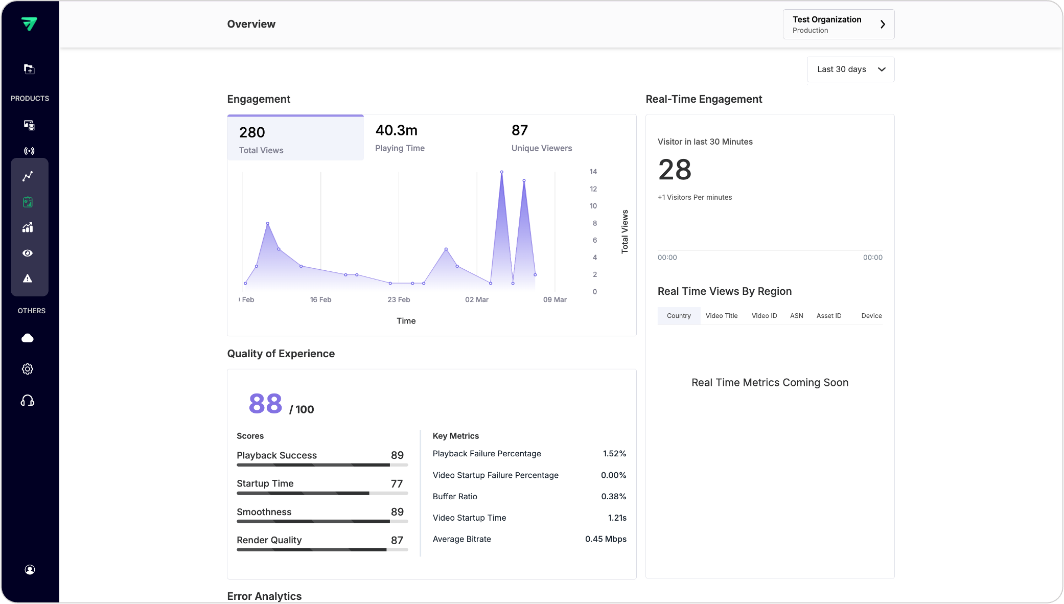
You can also find a section for Error Analytics which gives the summary of playback failures that occurred within the workspace in the selected timeframe across various platforms like web, iOS and Android.
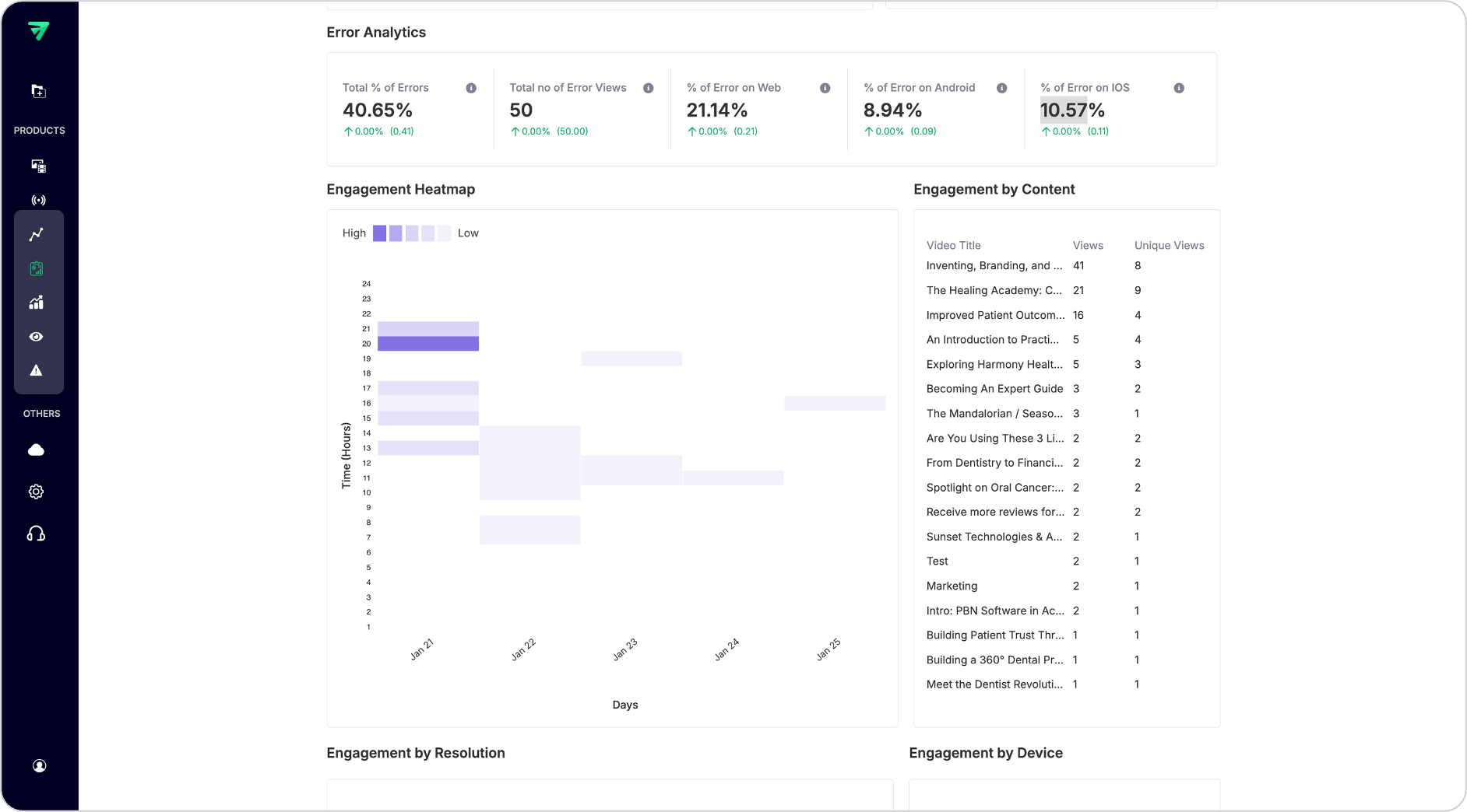
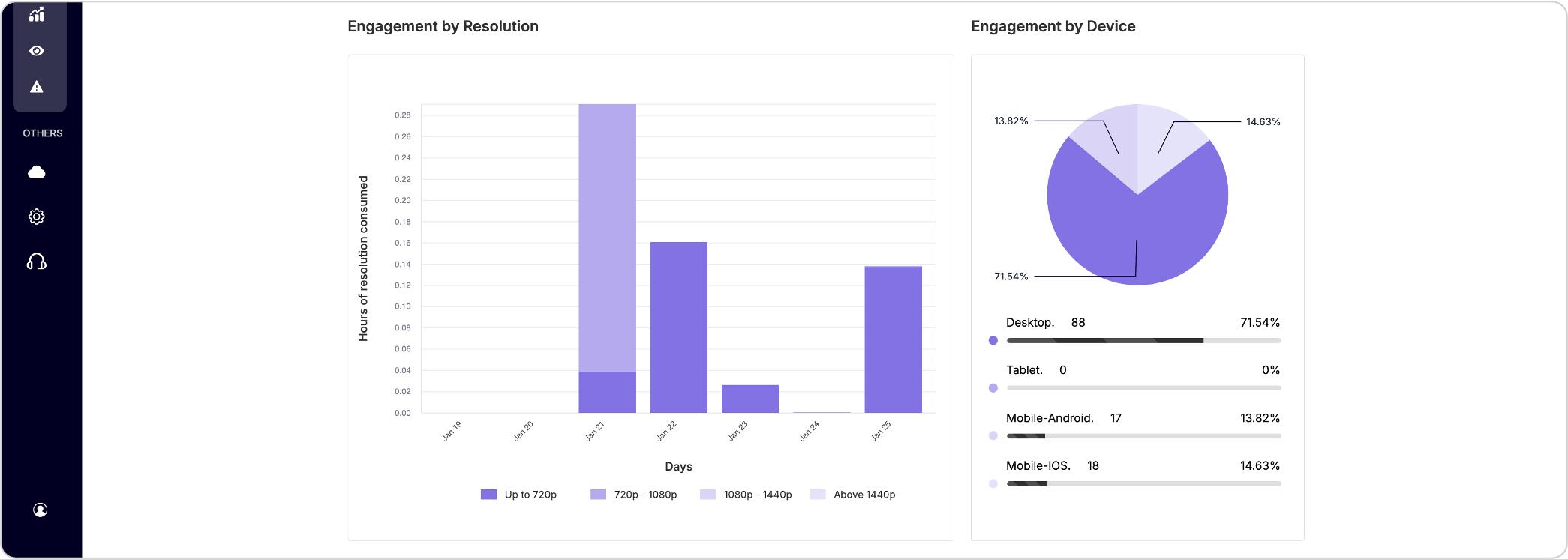
The dashboard also outlines different Engagement visualizations which give you more insights on the user activity within your platform to identify the most popular content, peak engagement times, preferred resolutions, network performance and preferred devices.
PLEASE NOTE
In the dashboard UI, filters are not readily available but you can utilize this functionality at API level and get insights by slicing and dicing the data.
You can draw more insights by slicing the data over geography, video formats, stream types etc.,
To get more info on the available filters you can follow our Filters and dimensions in data guide.
Additional: You can also apply custom_1 to custom_10 values as filters after you enable them in the dashboard. To get more details please refer Custom Dimensions guide.
Updated 7 months ago